This is my final animation.
Thursday, 8 July 2010
Camera and Lighting
There wasn’t much thought that went into the camera. It was simply a matter of key-framing whatever I thought worked best. Because I was working alone on this project, I could afford the luxury of not creating and following a storyboard as I knew in my head exactly how I needed to make this look. Not much trial and error was involved either, which is the beauty of working with 3D software. The angle that you see in the viewport is effectively how you will see it in the camera.
But, in my haste, I had forgotten to set appropriate lighting, resulting in my final render looking very dark. Please look at the image below, which does not have any lighting:
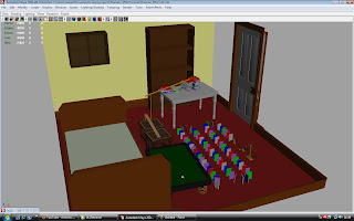
In order to fix this I assigned a light to every wall of the room. So that is four, and one from above, as if on the ceiling. This provided sufficient lighting and let some of the materials that I have worked with, such as phongs for plastics, shine.
Finale
My original intention was to have the final scale get weighed down and pull at the string of a party popper that is attached to the scale’s head, as can be seen from the picture below (circled red):
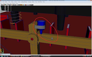
In order to achieve this I would need to create a few controller constraints attached to both the string and the party popper itself, and set them up so as the string would straighten as the scale tipped. This proved quite tricky however as I was having a few parenting issues. It is simply a matter of me being rusty in my Maya skills at this moment in time. I mentioned that I am confident earlier, but that is only in the modelling and texturing area. Regarding rigging and animation I have much work to catch up with. Fortunately this task wasn’t too demanding and this was as complicated as it got.
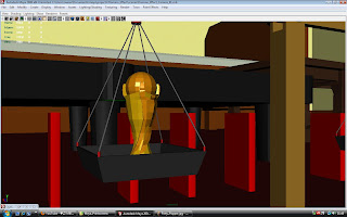
And so, without a nice finale, I was forced to improvise. I came up with the idea of placing a model of the FIFA World Cup that I had already modelled for a previous assignment on one of the cups of the scale so as it would lift in glorious fashion at the end of the animation.
Issues
It was a simple enough task to scale and transform all of the objects so as they would interact with each other perfectly, but one thing that I had overlooked were the books that would topple over one another.
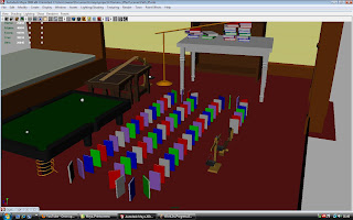
As is visible here, there are a wide variety of books of different colours. That is, three rows. This would have been unnecessary in the final animation as it would have prolonged it. As an alternative I decided that I could convey the same message with a lesser number of books. The domino effect would remain and the same result would be achieved in a shorter amount of time. I changed it to something like this:
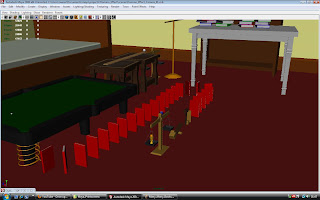
Another reason for altering this section was because I did not want to mess with the flow of the overall domino effect. What I mean is, in the part of the animation before the books begin to topple, the ball rolls down a coiled path. The ball rolls at a slow pace before it builds up the momentum necessary to be able to knock down the first book and look convincing. Two slow sections back to back would bore audiences, and thus it was in the best interest to speed things up.
Regarding the original books being multi-coloured and the replacements being only red, the reason for that is because upon separating the polygons for texturing in the original set, they would move off in different directions when rotated, and thus couldn’t be animated. I tried for several hours to fix the problem but to no avail, and decided to start over. In the course of my frustration I opted to duplicate an existing book that I had previously modelled that was laying on the table. There were no problems with that, I don’t know why.
Modeling Begins
I started the modelling process by completing everything that was interactive first. I would worry about textures, pivot points, and backgrounds at a later stage. My main priority was to position all of the objects and ensure they were scaled and transformed correctly, and to ensure that polygons did not conflict with each other.
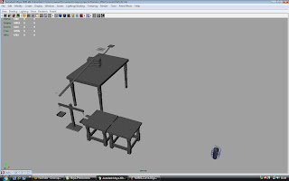
Once everything was modelled and positioned, I started to think about a background. A simple room sufficed. Four walls, once ceiling and a door. Other miscellaneous objects made appearances, such as a bed, a shelf, and a small cabinet. However, I didn’t want for them to be overly detailed or to place objects on or around them in order to keep the focus on the mechanism itself. These were very simple to create, and the only issue I had was placing them in a position so as they wouldn’t block the main feature, that being the domino mechanism.
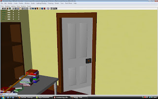
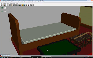
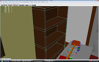
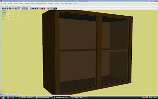
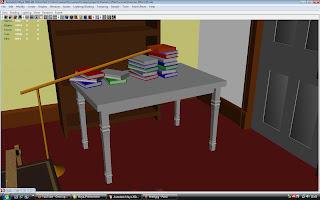
There wasn’t much of a need for modelling tests as I am quite confident and familiar with Autodesk Maya at this stage. That is not to say that I am a master, but for work like this it was straightforward as many of the shapes I had to deal with were primitive and easy to develop.
Egg Timer
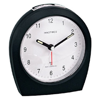
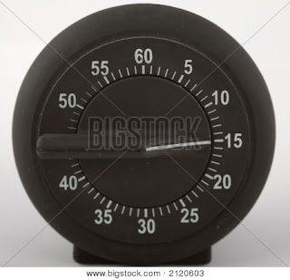
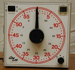
Just a few images that I collect in reference for the egg timer that never was. The idea was to have a light wooden mallet of some sort attached to the hand of the egg timer. The timer would reach a certain time, and in doing so the hand would move, and therefore as would the mallet. The mallet would hit the ball and the cycle would continue.
Coils
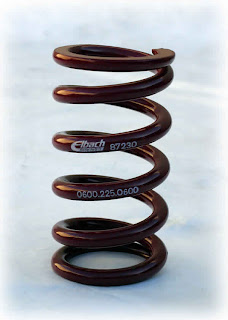
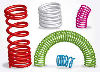
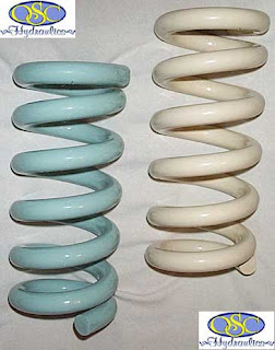
I knew enough that I wanted to construct my coil using a series of NURBs curves and surface lofts. As I was going to be constructing the coil manually, that is to say, that I would make the swirly shape by eyeballing it rather than resorting to an image plane, so I looked up various coils online just to bring myself to terms with different angles it may take.
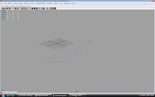
I started off with a very simple shape, and continued from there.
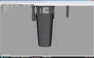
The coil itself didn’t look too great; it was misshapen and deformed, but from an angle it was acceptable. It is not completely evident in these images showcasing the construction stages, but please look at the most bottom curves on the left hand side. They are slightly wide.
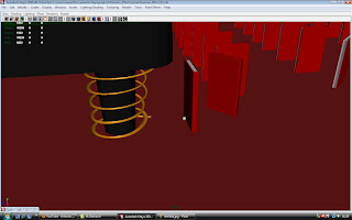
With the final shape looking like:
Scales
I already knew the role and locations of the scales, so now I just had to decide on what the scale would look like. The scale was to be the most animate object in my mechanism. I would have to make sure that were no conflicting polygons, and that pivot points were adequately centred. As well as this, I needed to take into account factors such as gravity, as the cups on either end of the scale would be affected accordingly to any change in position. As menacing as this sounds, it was merely a matter of trial and error; that is, trying out different speeds of movement.
During my research I came across two types of scales: beautiful, majestic scales, and plastic fisherprice-esque scales. At first I had my heart content on a beautiful one. It would not have been hard to model as I am confident in my skills in that area. However, as far as animating went, it may not have been as simple. For example, from these images, it is not very easy to determine where the centre of pivot is located, and hence, would be difficult to replicate myself. If I had tangible version of the scale it would have been very possible, but a few images wasn’t enough.

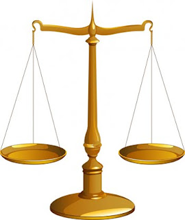
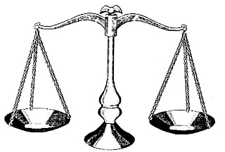

Now take a look at these scales:
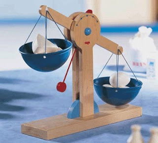
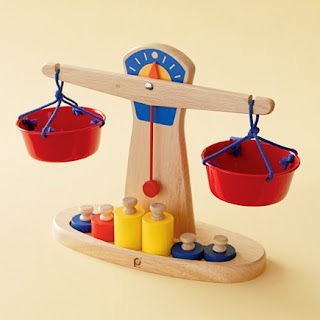
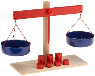
These are the plasticy ones that I mentioned earlier. The pivot points and the overall design is palpable just be pictures alone. It is no wonder why I decided to use these images as my main references.
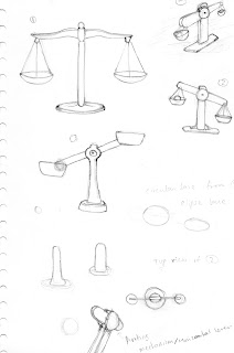
Half-Pipe
My main issue when dealing with this was whether or not it would match the parameters of the ball it would be leading. For example, would it be too wide to contain the ball and make it look like it could easily roll off the path, would it be too deep and constrict the ball’s visibility, would it be too thin, small, etc, etc. However, I soon discovered that, whether or not the path was constructed accurately and with prevision was mildly irrelevant because with a series of carefully located camers I could mask any irregularities. This was not necessary for straightforward paths like the very first one, but the coiled path around the leg of the billiards table is actually an inconsistent shape and is slightly deformed. It looks fine otherwise, as the camera isn’t very close to it.
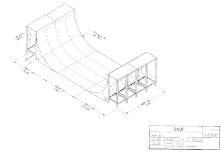
When considering the depth and height of the paths I looked at the following images:
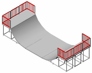
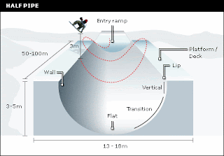
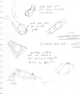
I also made a few sketches of potential alternatives I could use. For example, you can see a standard half-pipe, a railing, and a plank of wood. I opted not to use the railing, and decided the plank of wood would look better in another part of the mechanism, which you can see at the bottom left of the page.
Billiards Table
With the holes done, I could concentrate on the lower body of the table, which I wanted to look like one of my sketches:
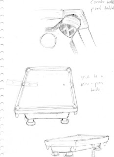
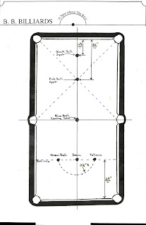
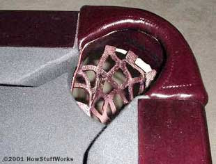
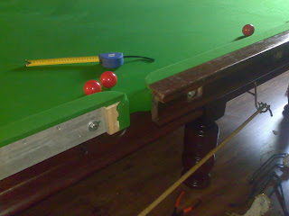
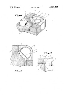
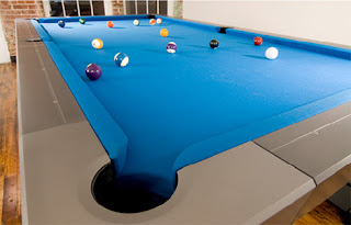
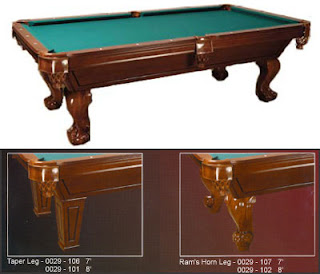
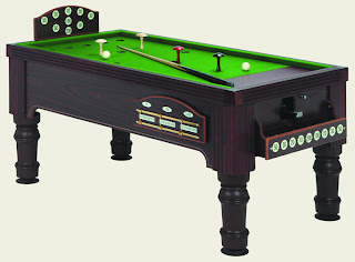
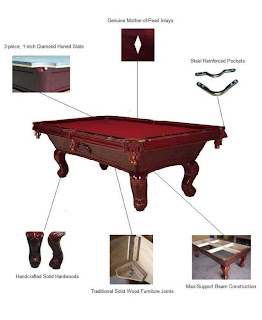
These are the images I used as references to create the billiards table. I considered the table itself and the pockets as different entities as they conflicted with one another when I was modelling. I started with the base of the table, and then used a second polygon object instead of trying to add the perfect amount of edges and extrude from there.


Thoughts...
With my design in place and knowing what particular objects would appear in my mechanism, I now needed to research them in order to know their shapes, sizes, and how easily or difficult they would be to animate. This would help the smoothness of my workflow and help to identify potential bugs and glitches. Anything that didn’t work out at this stage would be omitted and I would find an alternative. I only eventually came across one problem (which will be revealed later), and it wasn’t even a crucial one, with an easy fix.
The most central objects of my mechanism are a billiards table, balancing scales, half-pipes, and coils. I had planned for an egg-timer to make an appearance in which it would initiate the sequence by the hands on the clock turning and knocking the ball, but it seemed unnecessary as the sequence looked fine with the ball just moving on its own.
Designs
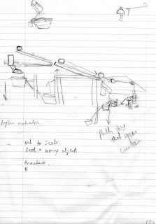
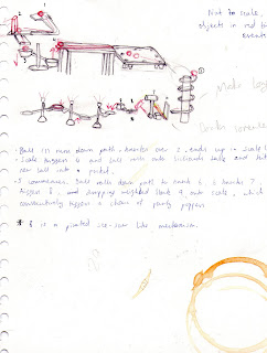
After watching the aforementioned videos, I felt confident enough to try my hand at creating some of my own designs. At first I thought it would be a challenge with a lot of trial and error, but armed with the knowledge I gained by watching the videos, and with a pragmatic perspective of things, it wasn’t so hard. From the very beginning I had envisioned my design revolving around a rolling ball, so it simply became a matter of getting that ball from A to B, albeit in a stylish fashion.
I made a very rough sketch on lined paper immediately, and from there I tweaked the design out and added to, and took away from, it.
First Research
I started off by watching various youtube videos of domino mechanisms.
http://www.youtube.com/watch?v=lOGqZAMHS-M
http://www.youtube.com/watch?v=-Bgc67rf26I
http://www.youtube.com/watch?v=s6OGg6eMRC4
http://www.youtube.com/watch?v=NyEWxaSVpHI