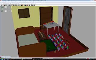
There wasn’t much thought that went into the camera. It was simply a matter of key-framing whatever I thought worked best. Because I was working alone on this project, I could afford the luxury of not creating and following a storyboard as I knew in my head exactly how I needed to make this look. Not much trial and error was involved either, which is the beauty of working with 3D software. The angle that you see in the viewport is effectively how you will see it in the camera.
But, in my haste, I had forgotten to set appropriate lighting, resulting in my final render looking very dark. Please look at the image below, which does not have any lighting:

In order to fix this I assigned a light to every wall of the room. So that is four, and one from above, as if on the ceiling. This provided sufficient lighting and let some of the materials that I have worked with, such as phongs for plastics, shine.
No comments:
Post a Comment